Watercolor Figures assignment
Watercolor fruit assignment
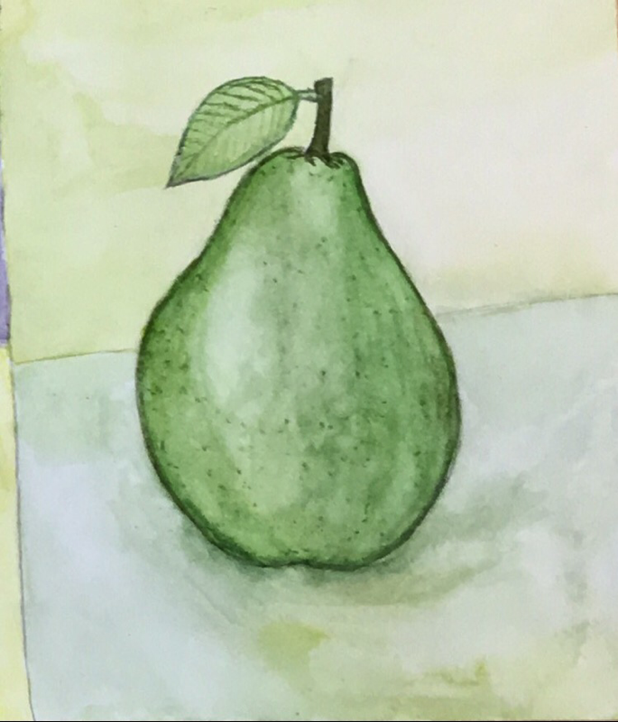
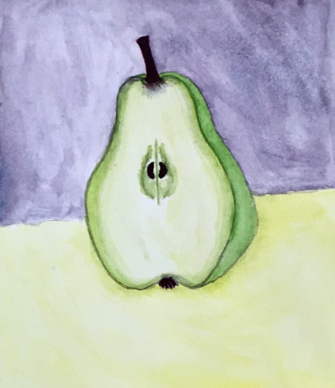
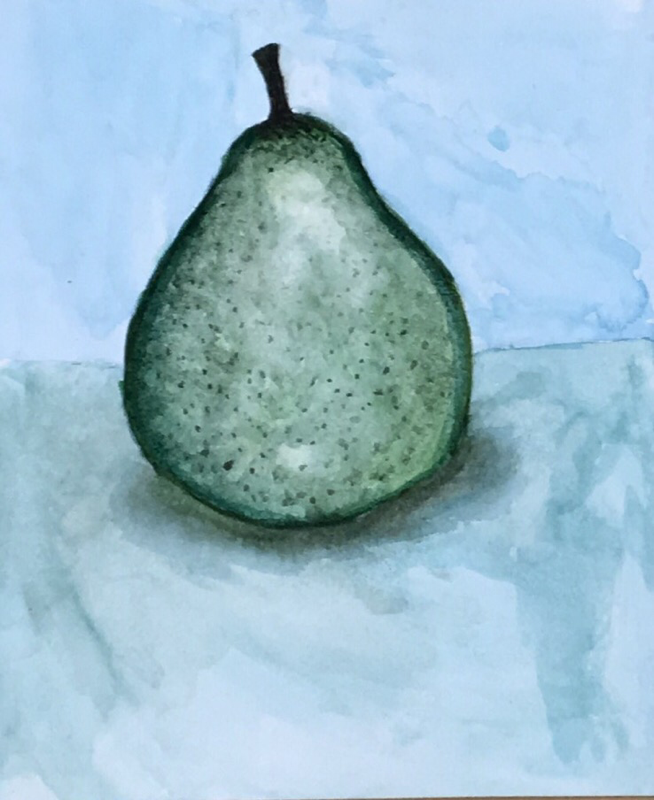
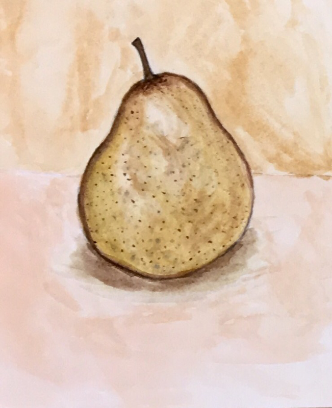
For our watercolor color scheme assignment I chose pears as my subject. While following each color scheme I focused heavily on highlights and shading which is difficult (for me) when using watercolors. I decided to change up the size and versions of the pear towards the end because making them all the same seemed boring to me. I feel I could've done better with the warm and cool color schemes but I am satisfied with my analogous and complementary pears.
Watercolor Final assignment
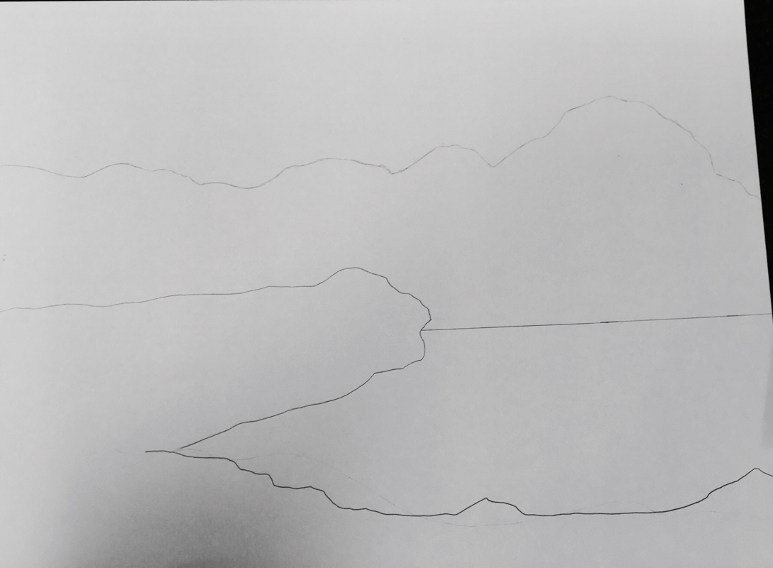
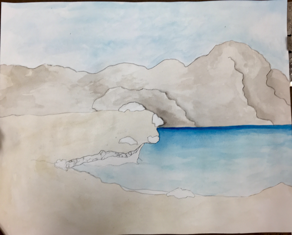
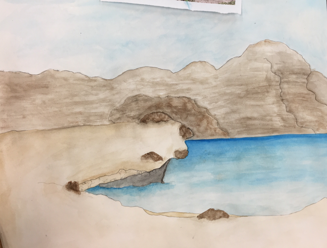
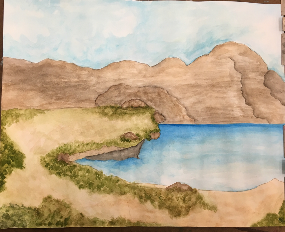
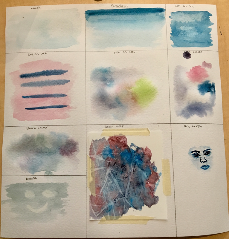
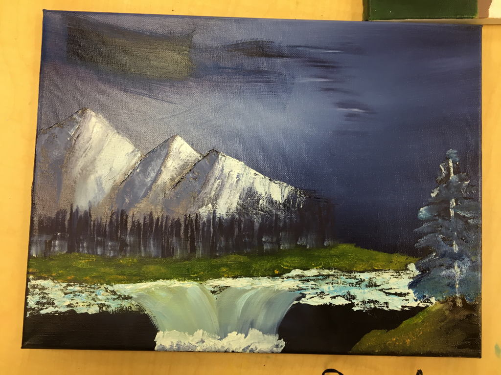
For my final watercolor piece, I found that the wet on wet technique worked really well when it came to creating the water and the mountains in my picture. Using transparent layers was very important because you had to build up to the color that you wanted instead of just throwing it on there (which would’ve made it look odd.) I feel like I utilized all of the elements of art in my piece, although I could’ve added more value and texture to my piece to make it look more realistic. Color choice was a very important factor when it came to my painting. If I chose the wrong color it wouldn’t end up looking lifelike. I had to darken the mountains and the water to create a realistic looking landscape. I could’ve improved my painting many areas. In some parts of the painting I messed up and tried to cover it up or tried to blend the color out. If I could redo the painting I would’ve tried to texturize the mountains and the shrubs some more. I feel like that would’ve improved the image a lot. I enjoyed working with watercolors, It’s somewhat easy and I learned that there are a lot of ways you can manipulate the watercolors to your liking (using salt water, Saran Wrap, etc.)
Hundertwasser Painting
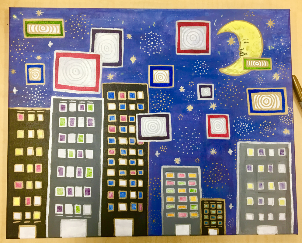
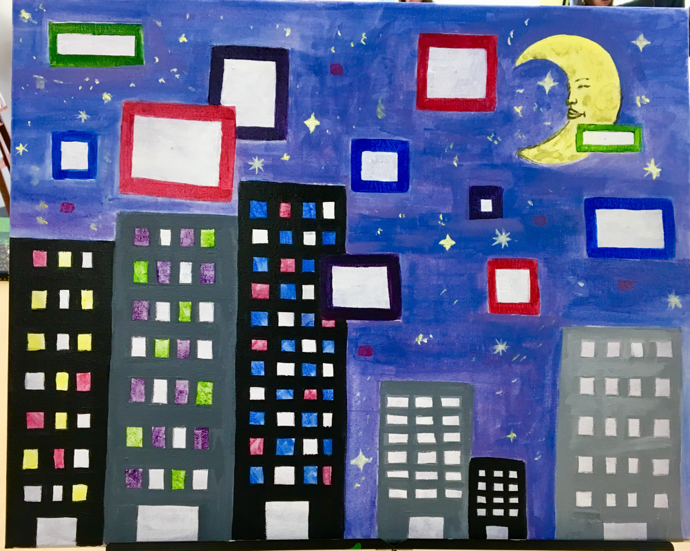
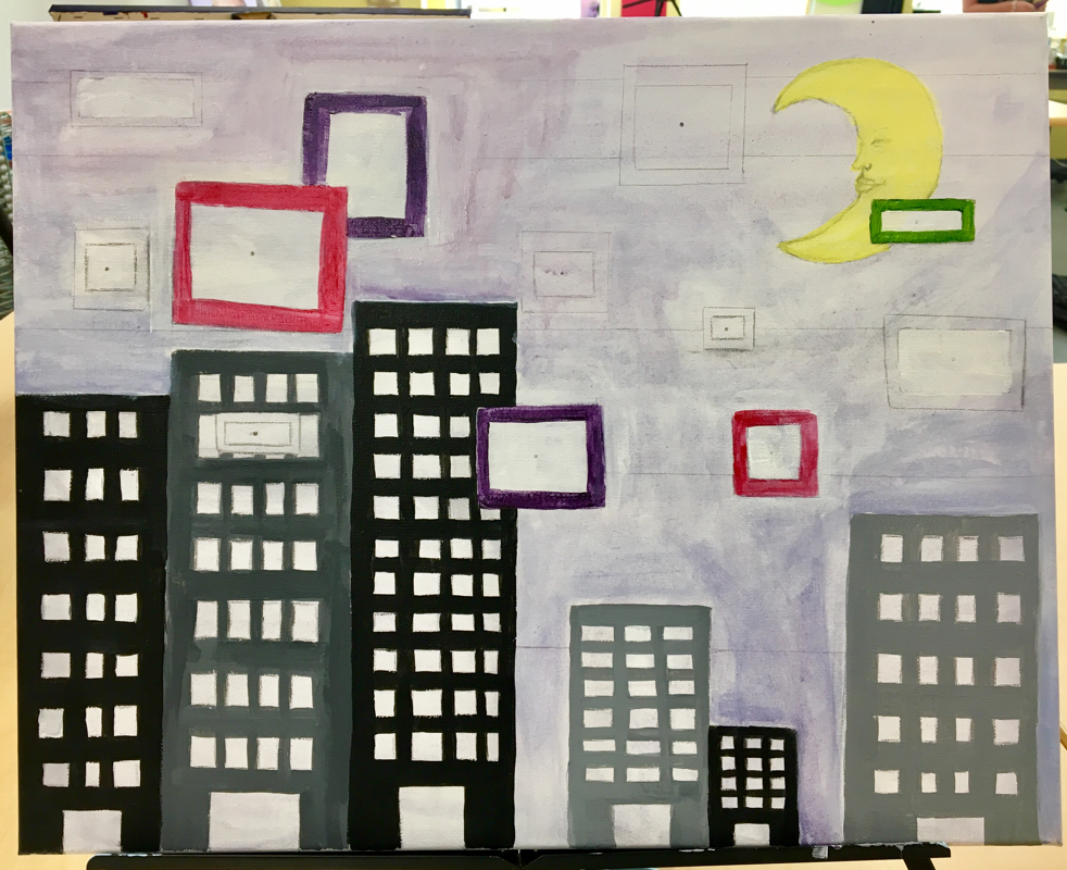
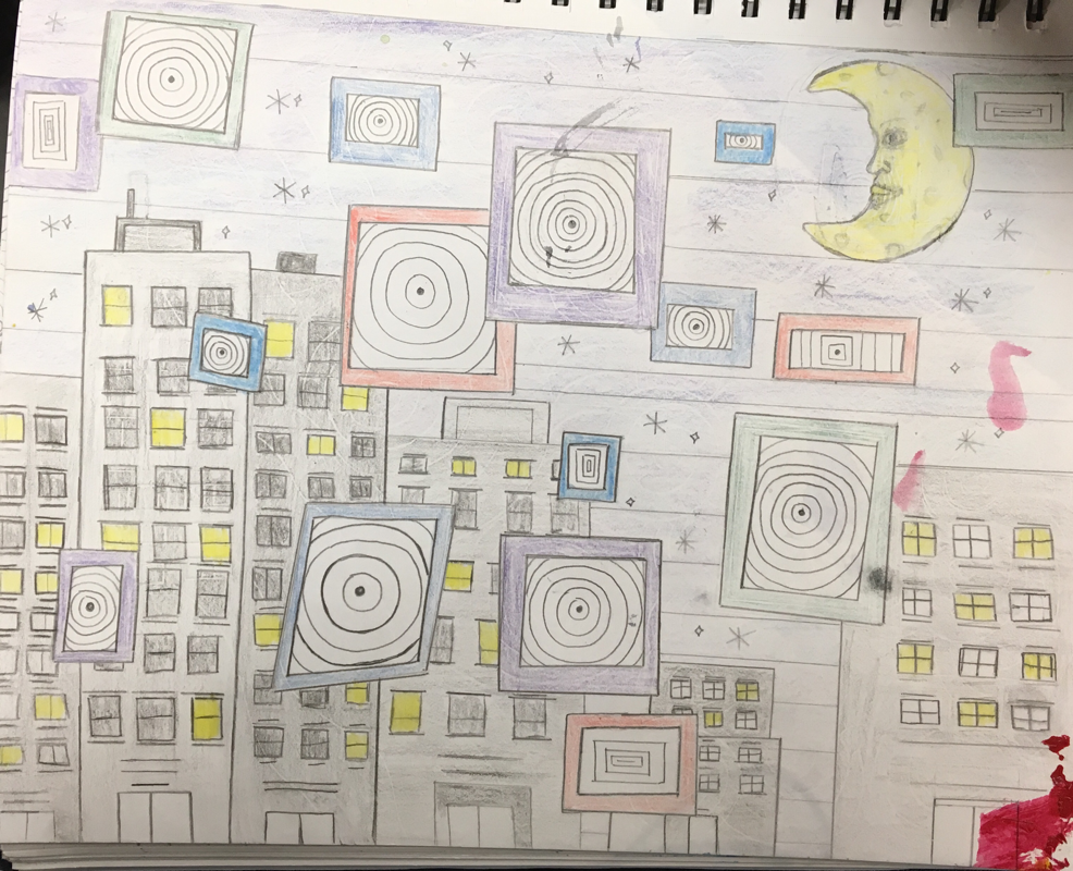
For my Hundertwasser painting I was inspired by a colorful and abstract city mural I saw while visiting New York City. I tried my best to make the painting neat and colorful but I struggled to do so. I incorporated ideas from pictures of the Hundertwasserhaus in Vienna, Austria to improve my piece. I used colors that would make my painting pop, such as the primary colors and various cool colors for my background. The focal point in my piece is the smiling crescent moon. It ties together my theme of nighttime and stands out in all the cool colors. For my embellishing I feel I ran out of ideas so I just outlined all the buildings, windows, and filled the empty spaces in my piece with spirals and dots with silver and gold sharpie. I didn’t put a border in my piece because I didn’t really know what to do and I felt that it would take attention away from the buildings and the focal point (the moon.) I faced a lot of difficulties during this painting. I’m not the best when it comes to working with acrylic paint so I had to paint over areas where I messed up many, many times. Although I had a hard time, I really like how my piece turned out in the end.
Oil Painting Practice (Pumpkin)
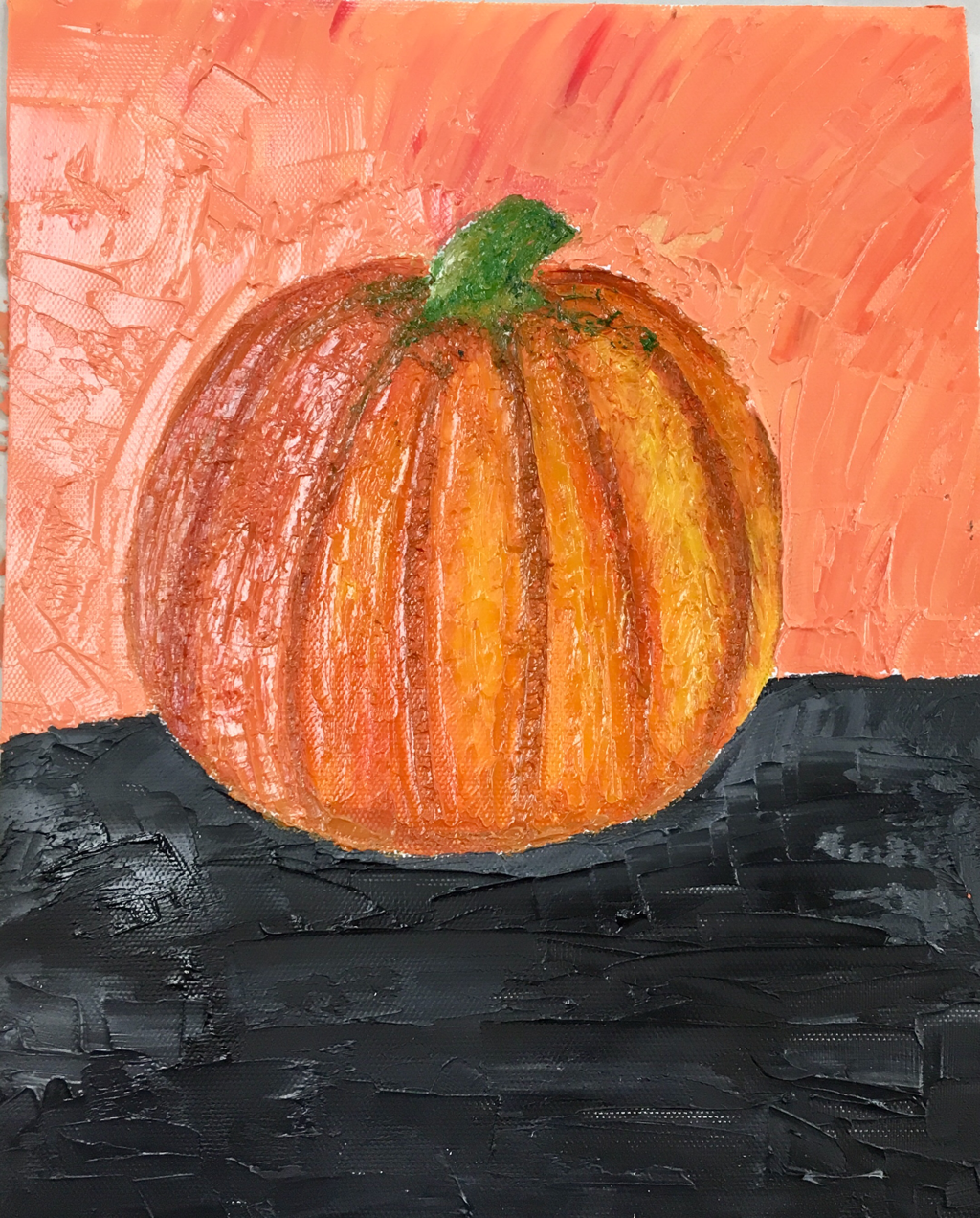
I had never worked with oil paints prior to our practice assignment and at first I found them quite difficult. Eventually I got used to working with them and I actually liked how easily they blended together. While my pumpkin didn’t turn out the best, It was good practice for future oil paintings. Using the palette knives create a bit of a challenge while painting with oil but if you hold them the right way you can maneuver the paint to your liking which was something I discovered later on into painting the pumpkin.
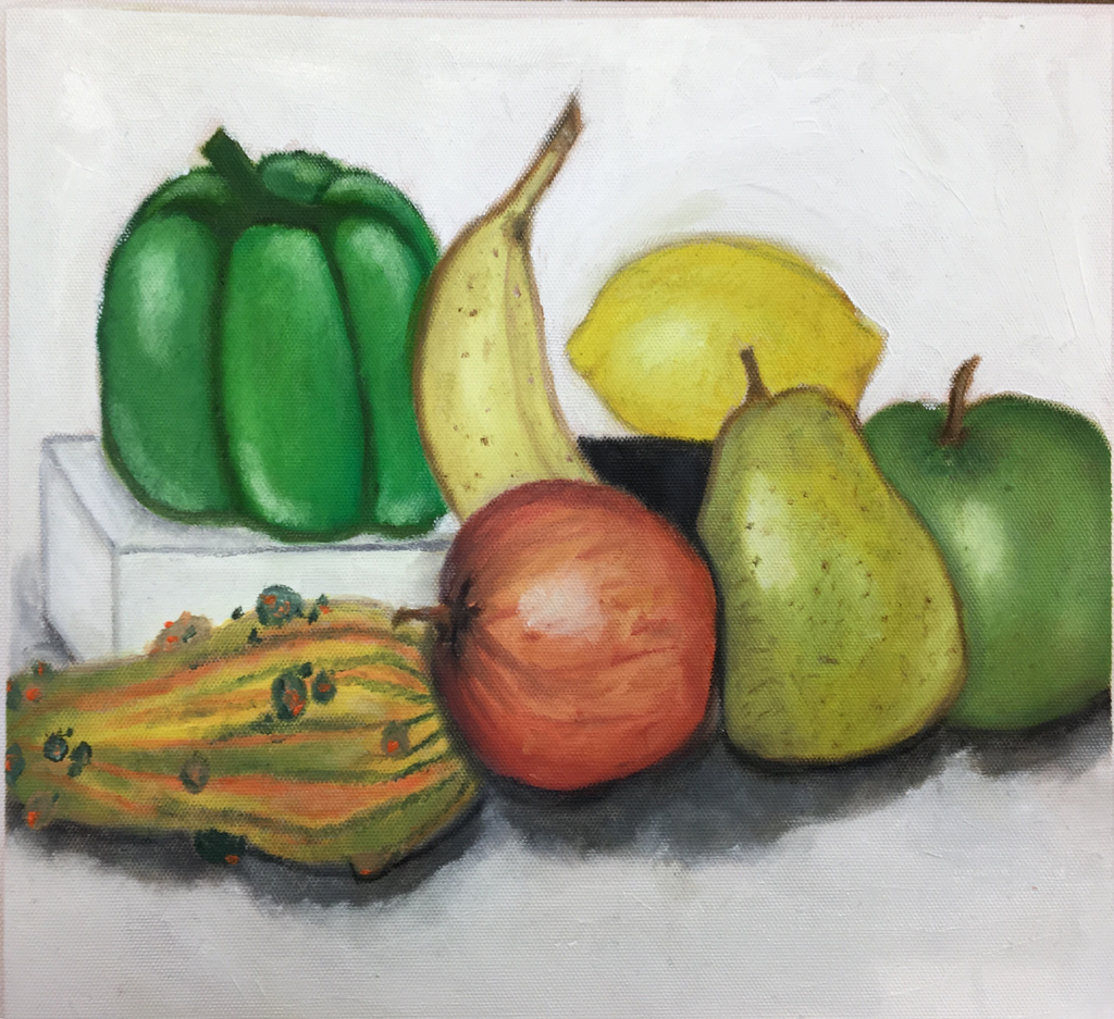
Oil still-life painting
Oil Landscape
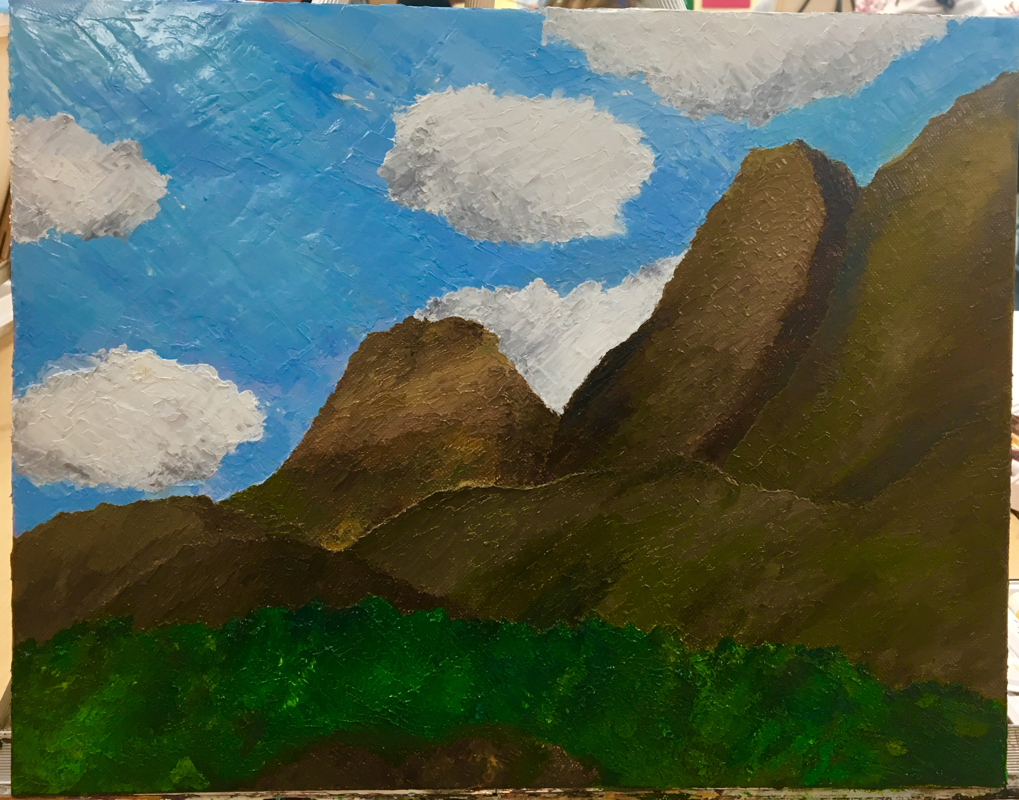
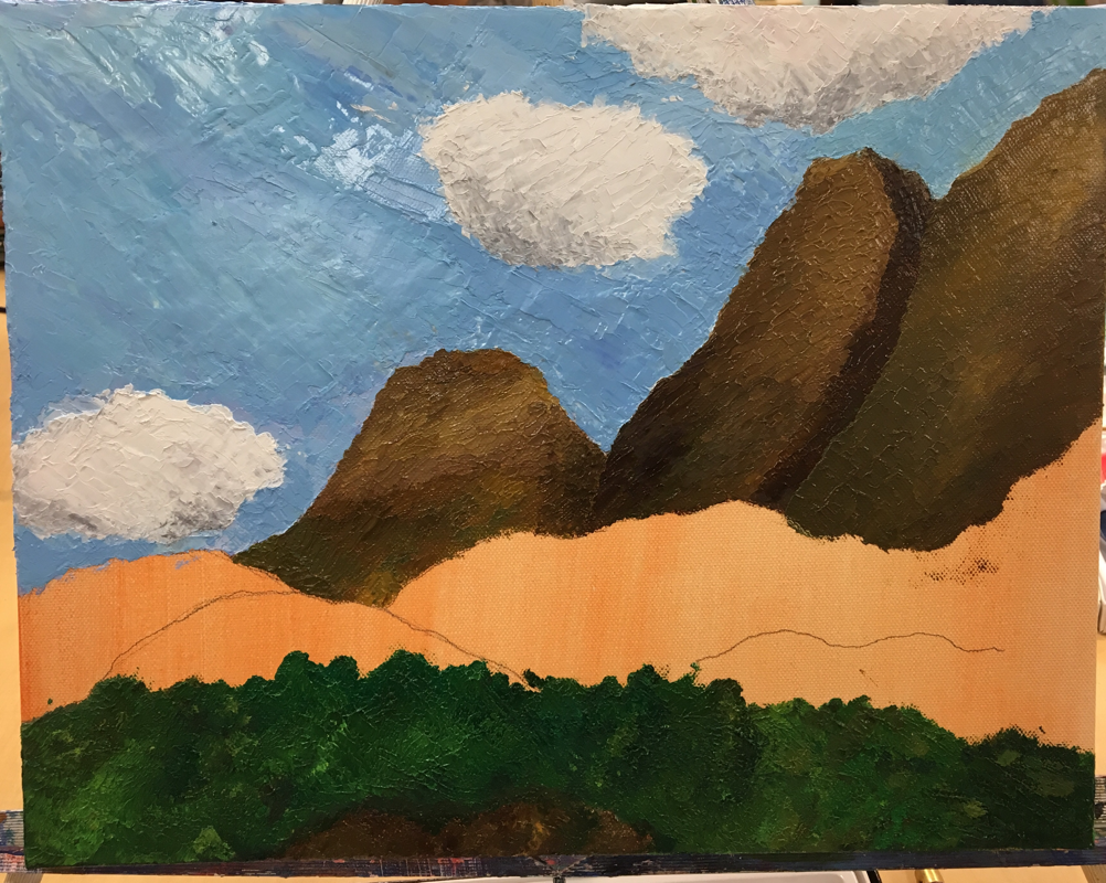
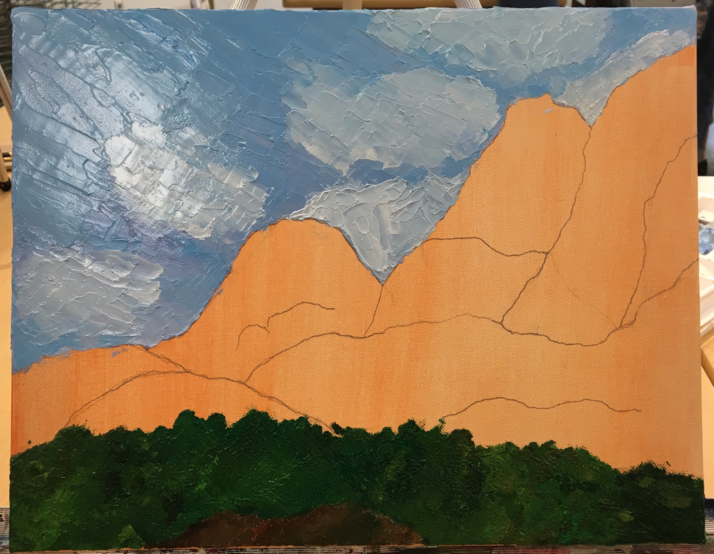
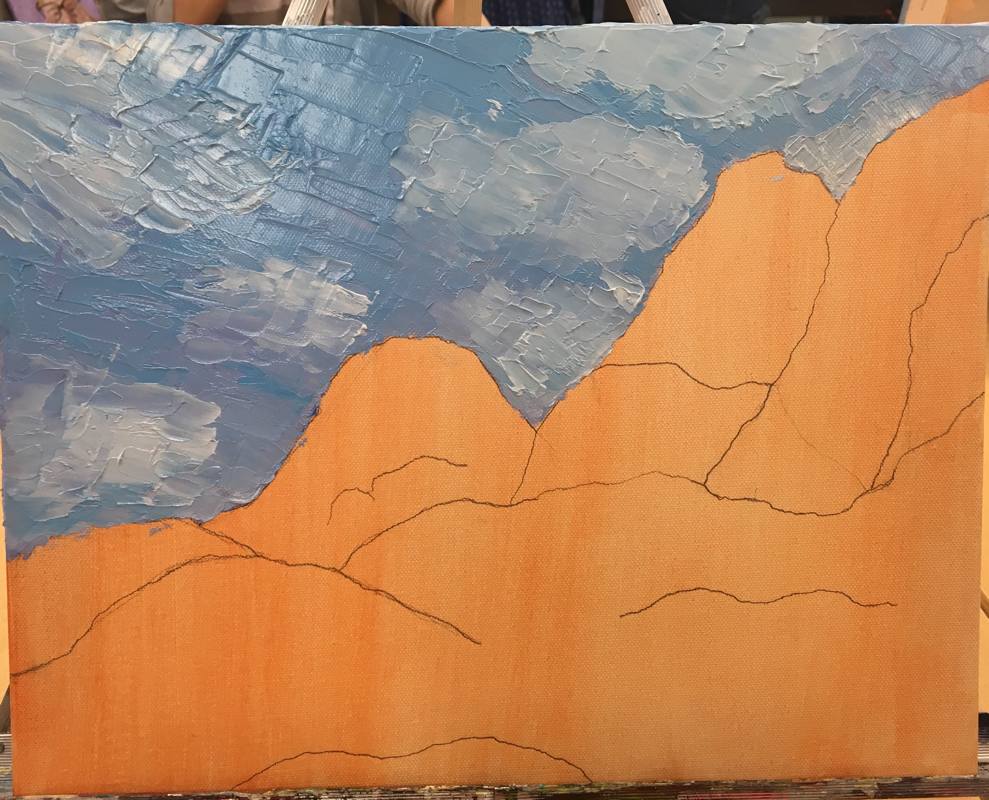
Throughout this project I worked to improve the neatness of my piece, It's not perfect but I'm still satisfied with how it turned out. When drawing on the canvas, I tried my best to make the mountain ranges look natural and realistic. I experienced some struggles due to the fact that we were working with oil and so I worked to avoid making the paint muddy. For my colors, I chose nature based colors like forest green or burnt sienna for the mountain ranges. Blending them was simple and it made creating depth a lot easier. I painted each mountain so that they were different in a more subtle way. When working on the clouds I struggled to make them look natural and lifelike but I eventually fixed them after a bit of practice. To create the greenery in my piece, I took different variations of green paint and blotted them, blending the colors together without making them muddy. Some difficulties I faced were the oil paint drying faster in other areas. I had to go back over those said areas and fix them. Overall, I'm not disappointed with my painting, although I could improve in lots of areas such as the clouds. I liked this assignment and I look forward to painting more landscapes.
Animal Portrait
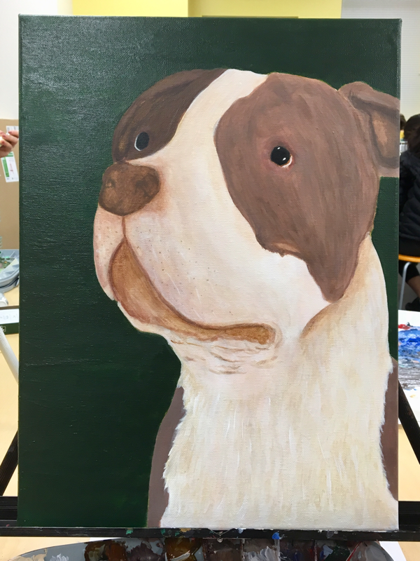
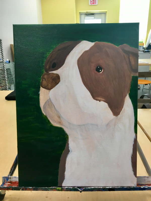
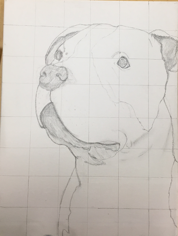
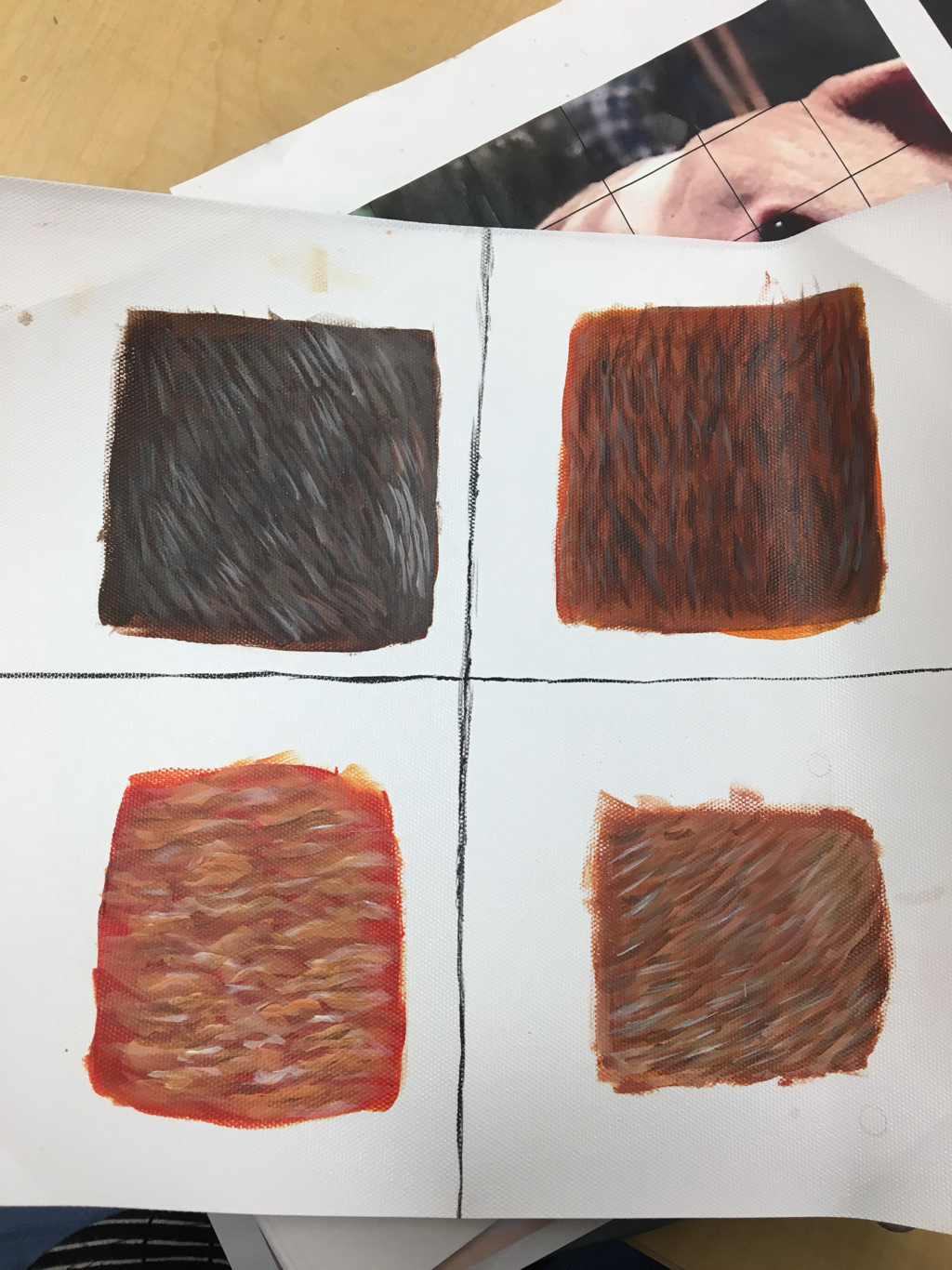
This project may have been the most challenging assignments we’ve had so far, in my opinion. When I began this portrait I had to achieve realistic fur which was slightly difficult at first. As I was drawing on my canvas I had to use the grid method otherwise the drawing would’ve been pretty rough. When painting the actual animal I found it difficult to create the correct colors for the fur. I either made them too light or too dark which caused the painting to look weird. Eventually I got a close enough color for the fur so I stuck with it. Adding values to my piece was also a bit of a challenge because sometimes I’d mess up or make the values too dark which led to me painting over my mistake. Towards the end of my painting I added texture and more fur in the white areas of my piece. I’m pretty impressed with my finished work seeing as I had never painted a realistic(ish) animal portrait prior to this assignment.
Fur Practice
Bob Ross painting
The Bob Ross painting sounded a lot easier than it actually is. In the video he moves at a fast pace (kind of) so following along was quite difficult. My attempt at the painting turned out okay until I tried to paint over a mistake I made when my hand (which was covered in paint) hit the dry part of my canvas. I missed out on a lot of details like trees and rocks because I didn’t have enough room left. Overall the experience was fun and very challenging.
