PAINTING (2019)
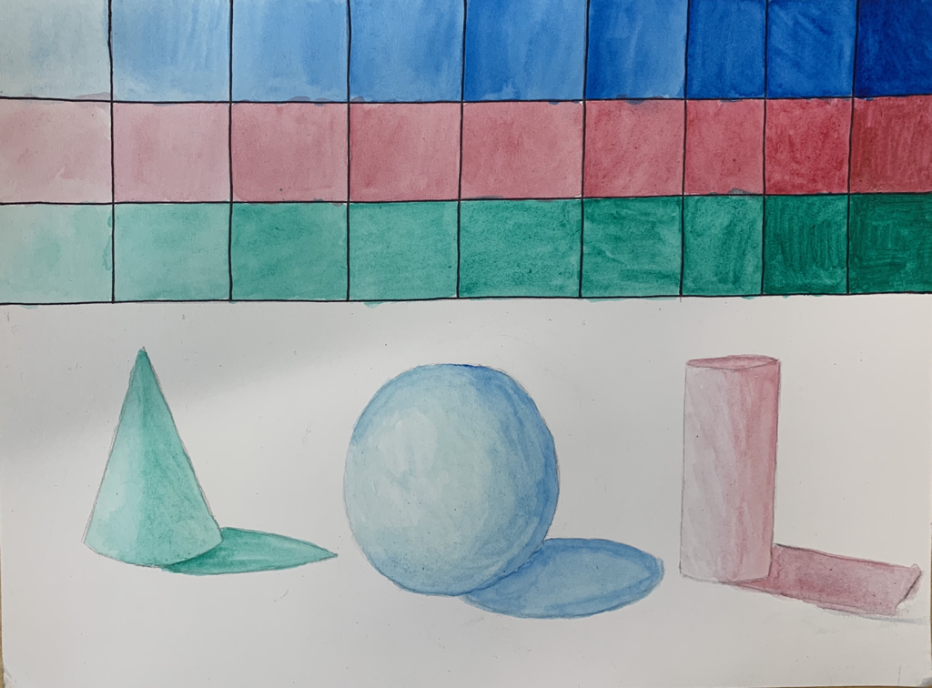
Watercolor Value Chart
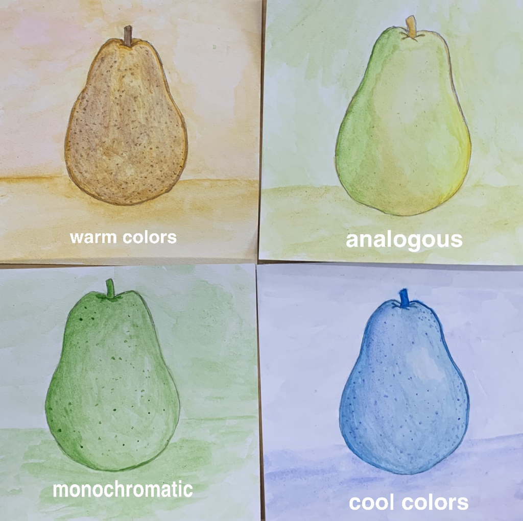
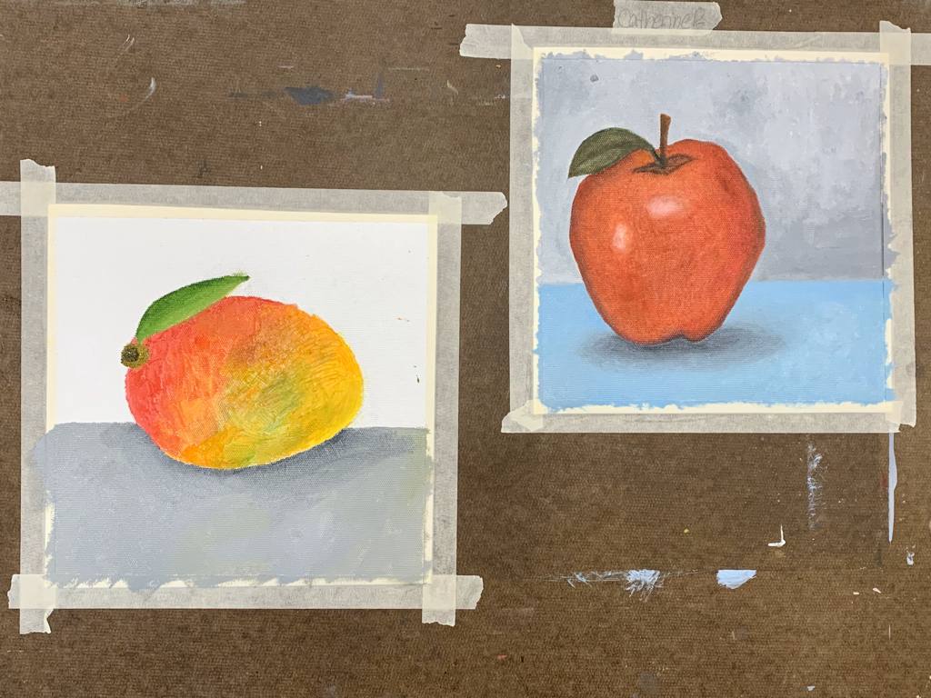
Watercolor Fruit
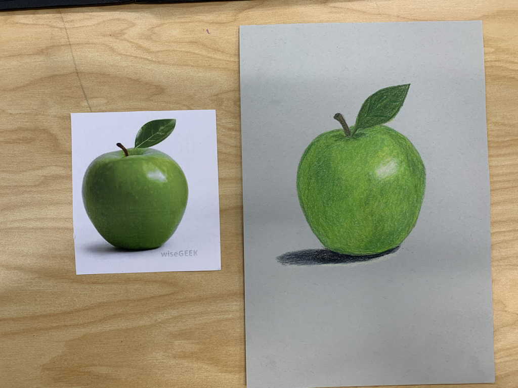
Prismacolor Fruit
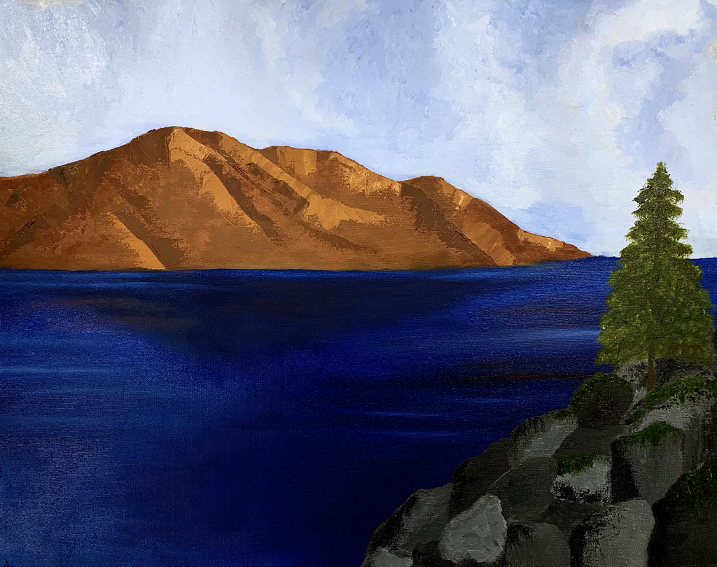
Watercolor Landscape
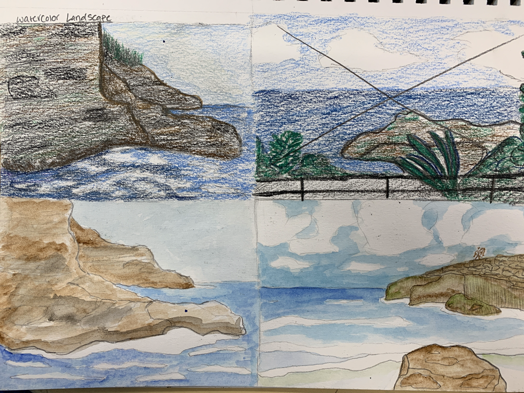
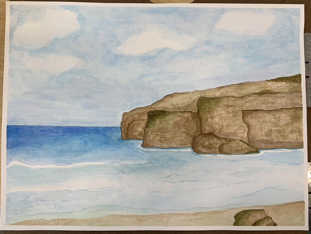
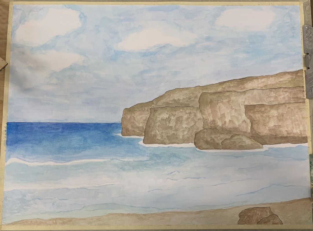
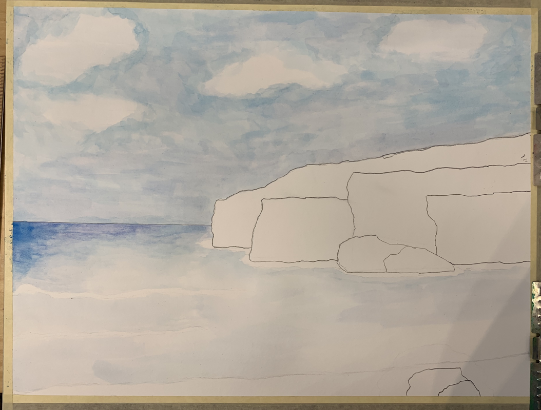
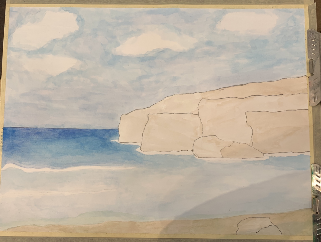
I had a lot of success using the wet on dry method. Using that method allowed me to create a lot of texture on the rocky cliffs. I used darker wet colors on dry light colors and then repeated that process until I liked what I saw. Using transparent layers was very important in my piece. I had to go later by layer with the water and build up the color as I went. Had I just went straight in with color it would’ve looked odd and I wouldn’t have been able to fix it later on. I feel as if I utilized all of the elements (form, shape, line, color, value, space, texture and perspective) in my piece, although I could’ve added more grass and texture to my piece to make it look more realistic. Color choice was definitely an important factor in the overall success of my piece. I had to make sure I chose colors that were found in nature and that also made my piece look realistic. I like working with watercolor, I find it easier to work with than other mediums. It’s all about working in light layers and building up color as you go. I feel like I was pretty successful in that area. If I was able to go back and change anything I would probably go back and try to add more detail in the waves and more detail in the mountains and clouds. With watercolor, I learned that you should work in layers and patiently build up color in order to have a nice looking painting. I feel like I could have improved my painting more if I had been more patient.
Hundertwasser Painting
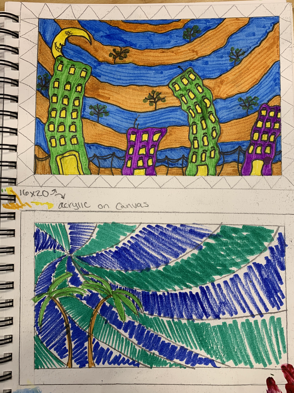
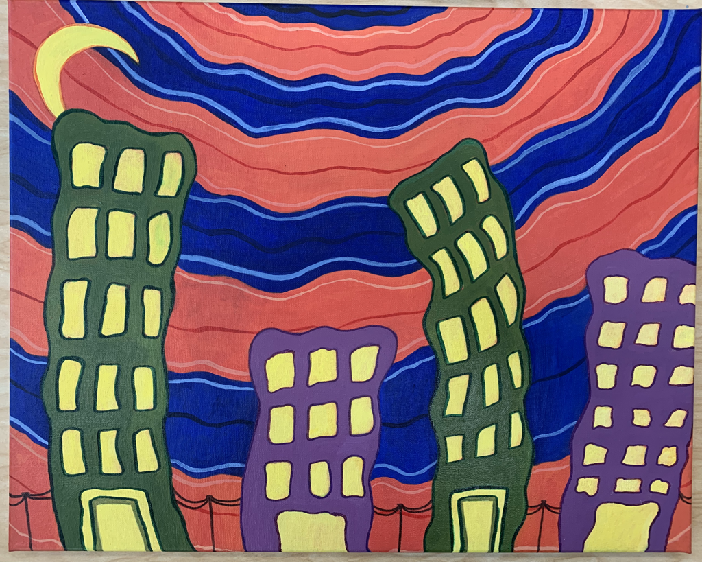
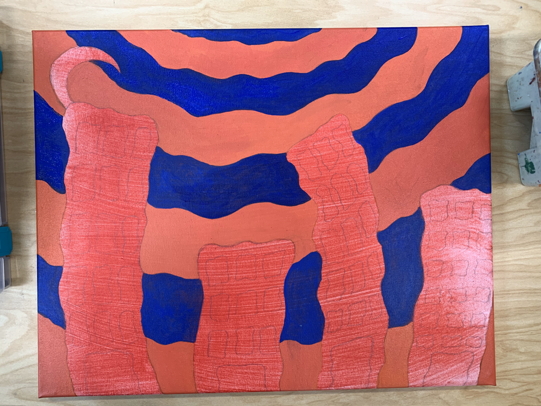
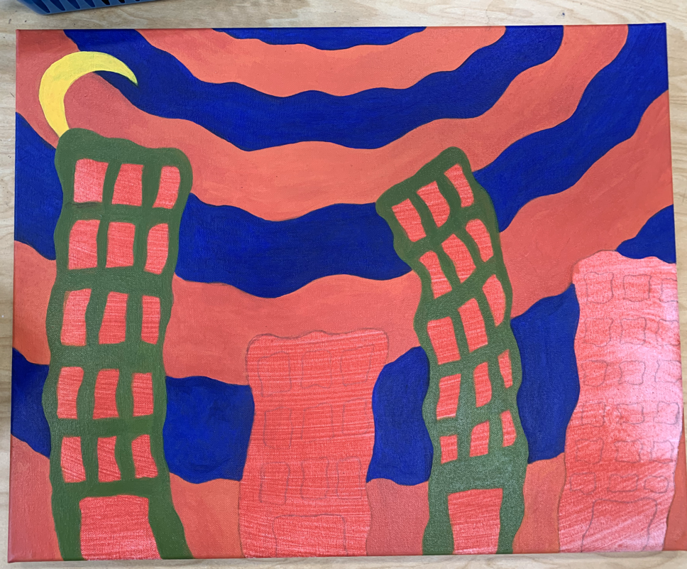
When working on my Hundertwasser inspired acrylic painting, I made it a priority of mine to try and make the painting as neat as possible. I spent majority of my time making sure all the lines were clean. I feel like my work embodied some of the traits that a lot of Hundertwasser's pieces presented. His paintings often depicted landscapes or cityscapes displaying lots of bright colors and curvy buildings. Since he was known for being opponent of straight lines, I tried my best to not include a lot of basic, straight lines. I made a lot of my buildings curvy to give my piece a bit of movement. For my color choices, I used a few complementary color pairs because I figured it would make the painting pop out to the eye. The focal point of my piece would be the buildings or the moon. They both draw the eye's attention due to the bright coloring of each one. I used a few basic patterns in the background but I didn't really use any in the foreground which was a mistake on my behalf. Overall, I definitely could've added more to it.
Oil Practice
Oil Landscape
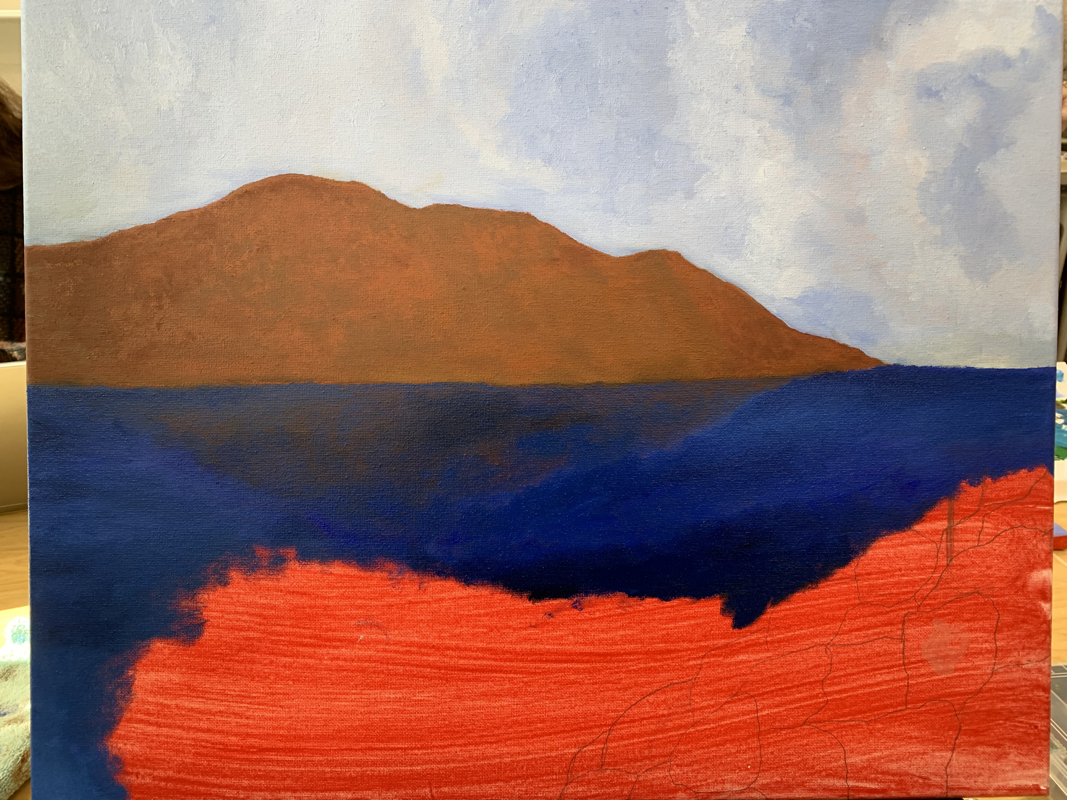
While working on this textured landscape piece, I struggled a lot with creating depth in the mountain range. In an attempt to hopefully fix the mountains while also adding texture, I ended up using a palette knife, an idea that was suggested by a classmate. The colors I used in my piece are a bit brighter than they are in the actual photo I took, which makes the painting as a whole look a little weird. I spent a lot of time on the water, trying to make it stand out and not just look like I slapped blue paint onto the canvas. I added different values of blue to the water in order to add depth and also incorporated red, black, and white to give the water an illusion of movement. Overall, this painting is not my best piece and I could've done a better job on it.
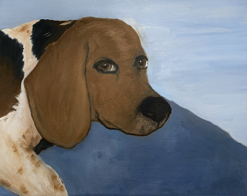
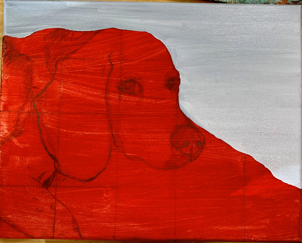
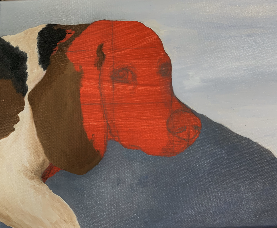
Animal Portrait in Oil
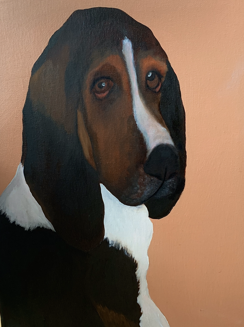
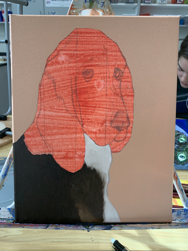
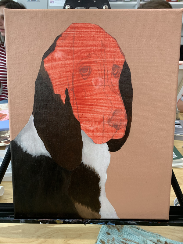
This painting is by far my favorite painting I've ever done in this class. I spent a lot of time on it and I think it turned out pretty well, despite what I thought in the beginning. I struggled a lot in the beginning with sketching out the dog, so I used the grid method to help make the sketch more realistic. When I began the painting portion, the main obstacle I faced was getting the fur to look real. I used different sized brushes and different values of brown to achieve the realistic fur. I also layered a bunch of colors in areas that I wanted to appear darker. I feel like this piece reflects my growth as an artist since it is noticeably better than all my other paintings I've done in this class. Overall, I like it and I am somewhat proud of how it turned out.
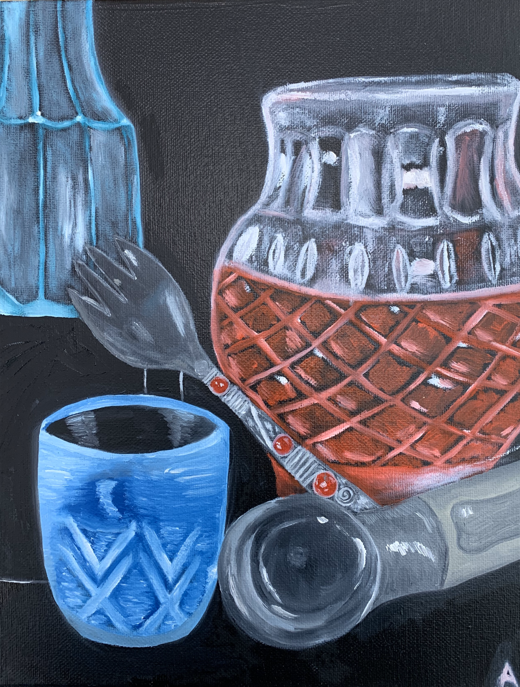
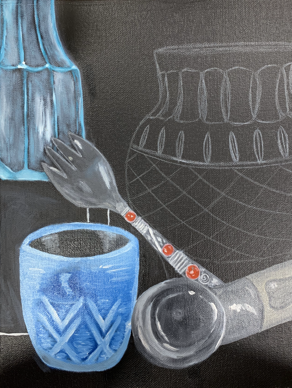
Still Life in Oil
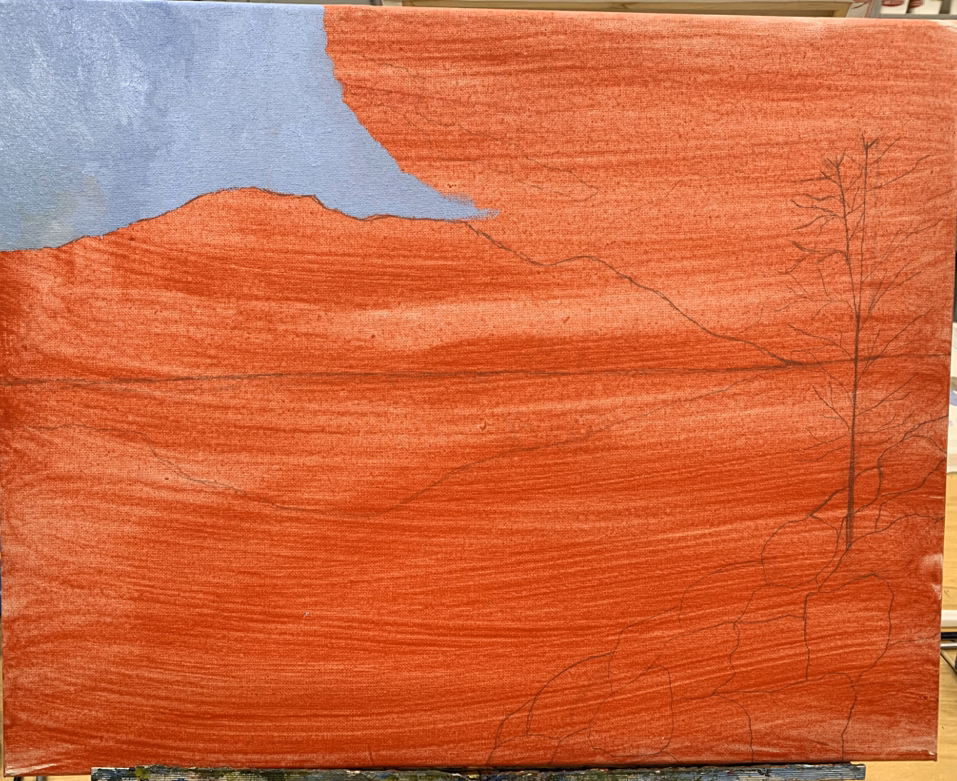
Final Painting
I intended for my final painting to turn out well, but problems in my out-of-school life took over my head resulting in me not really conducting much effort in my piece. I think it turned out bad and had my mind been more cleared up and I had gotten more sleep, I would’ve ended up with a better final piece.
Reflection
I thoroughly enjoyed taking painting for the second time. This class has taught me a lot about color theory and composition which has helped me considerably. When I look at my work from the first time I took the class, I notice the changes my skillset went through and all the improvements in my work. I don’t really consider myself a painter since my main artistic focus is with photography, but I will definitely keep up painting as a hobby. I will miss the art classes and the art teachers at Apex since I learned so much from all of them.
