ART 2 - 2018
Prerequisite Drawings
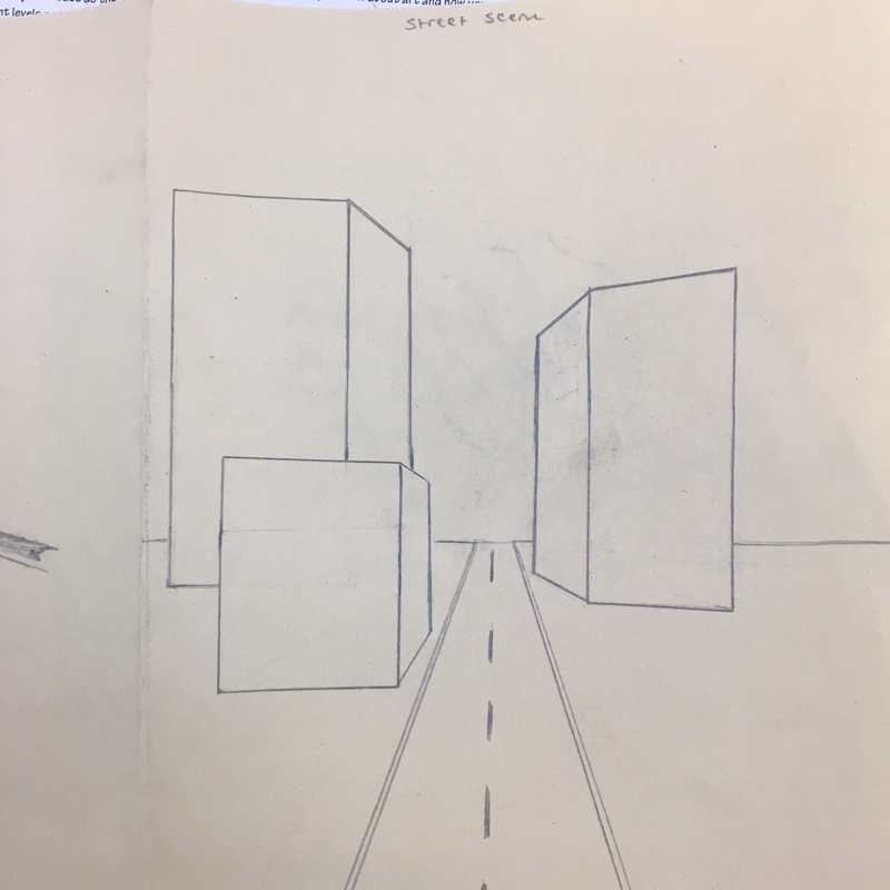
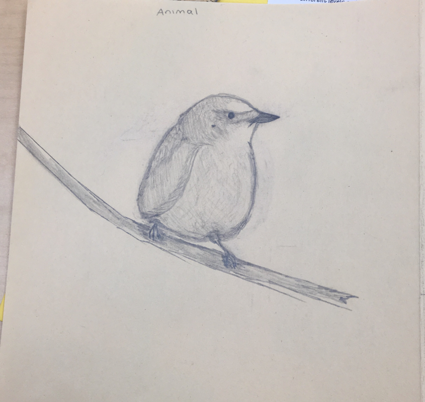
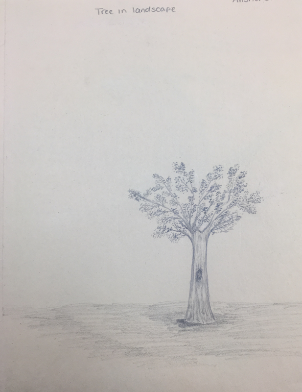
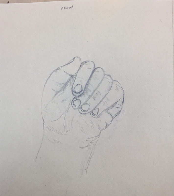
The first assignment we were given was to draw 4 different things. An animal, one point perspective street scene, a tree in landscape, and a realistic hand. I struggled with one point perspective because it’s been awhile since I last did it.
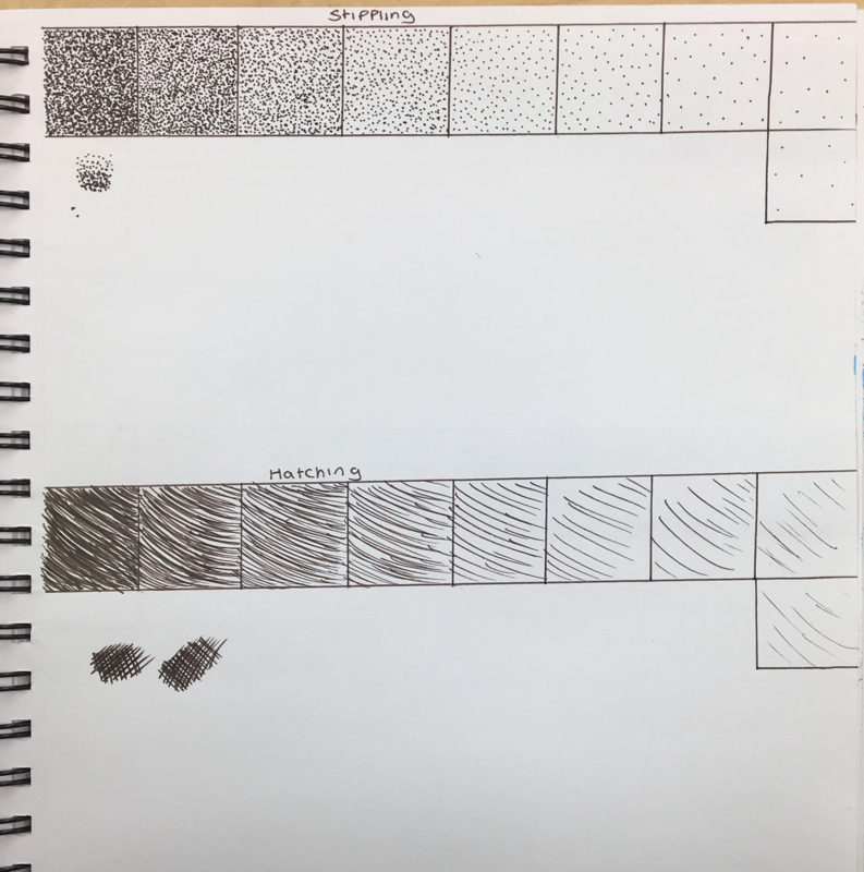
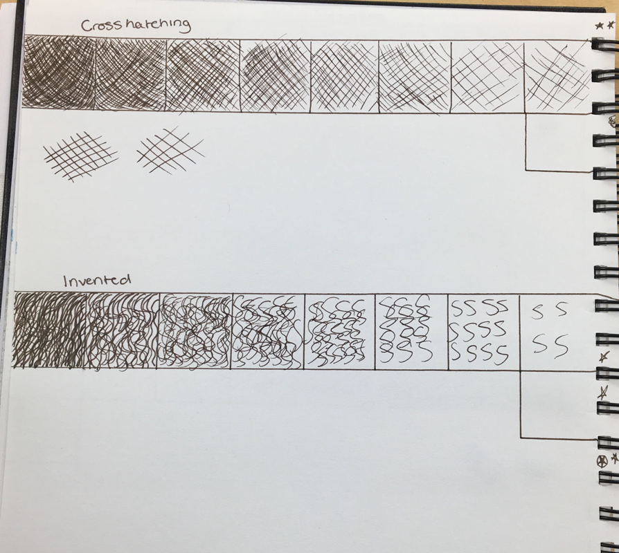
Value Charts
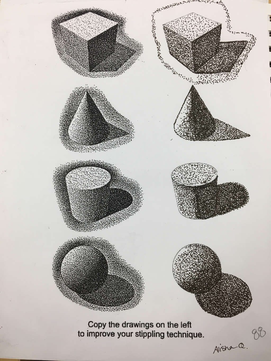
Stippling Worksheet
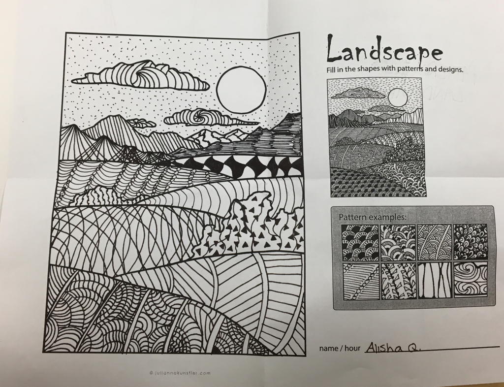
Pattern Landscape
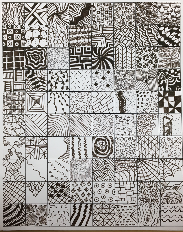
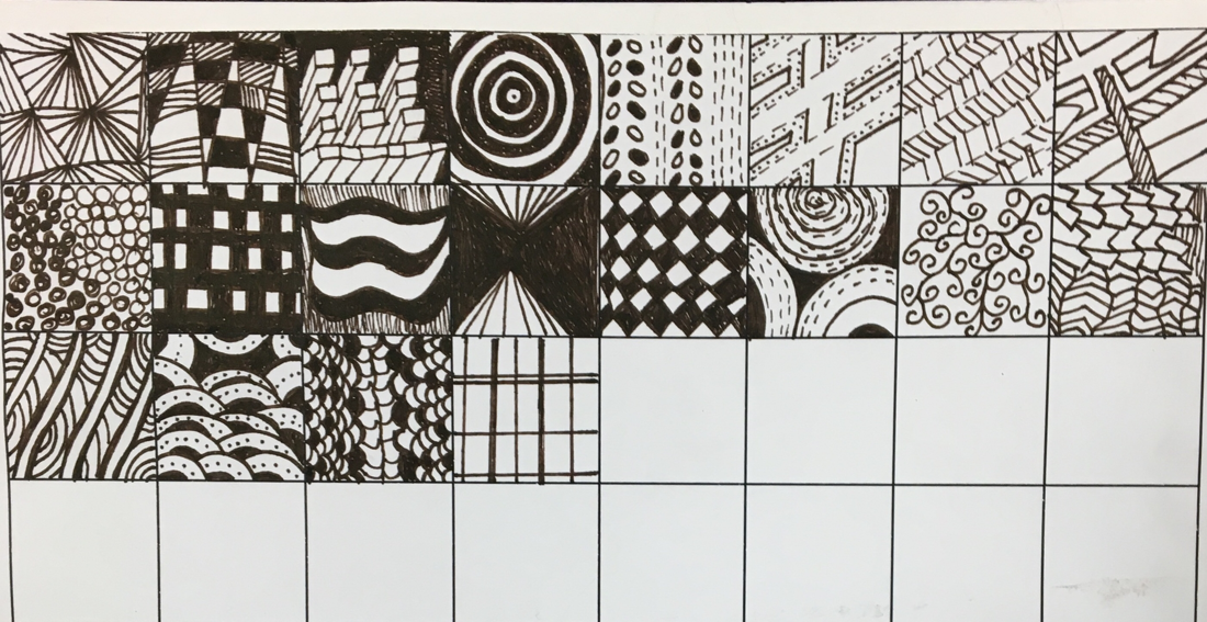
100 texture squares
Pen & ink final
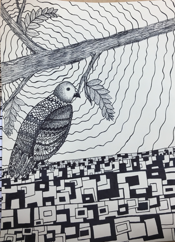
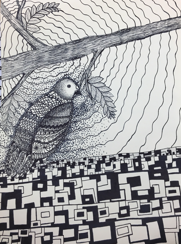
For our pen and ink assignment I chose to do a bird, most of the patterns I used were line related. I tried my best to add texture to the bird’s feather by using small repetitive pen strokes. Since I chose to do a bird for my project, value was very important if I wanted it to look semi-realistic. I used darker patterns when I was adding value to areas like behind the wing of the bird. I feel like I could’ve definitely done better, I could’ve maybe chosen a better subject for my final piece but I’m not mad about the outcome. Understanding concepts such as pattern and value are very important when creating most pieces of art. Value is essential if you are planning on making something stand out or something realistic. In future projects, I’ll probably take more time on areas that require a lot of work and do the small details in the end. If I could recreate this piece I’d probably choose a different subject and enhance the values and add more patterns.
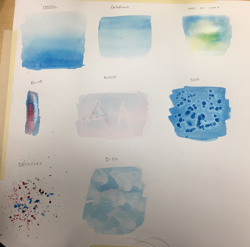
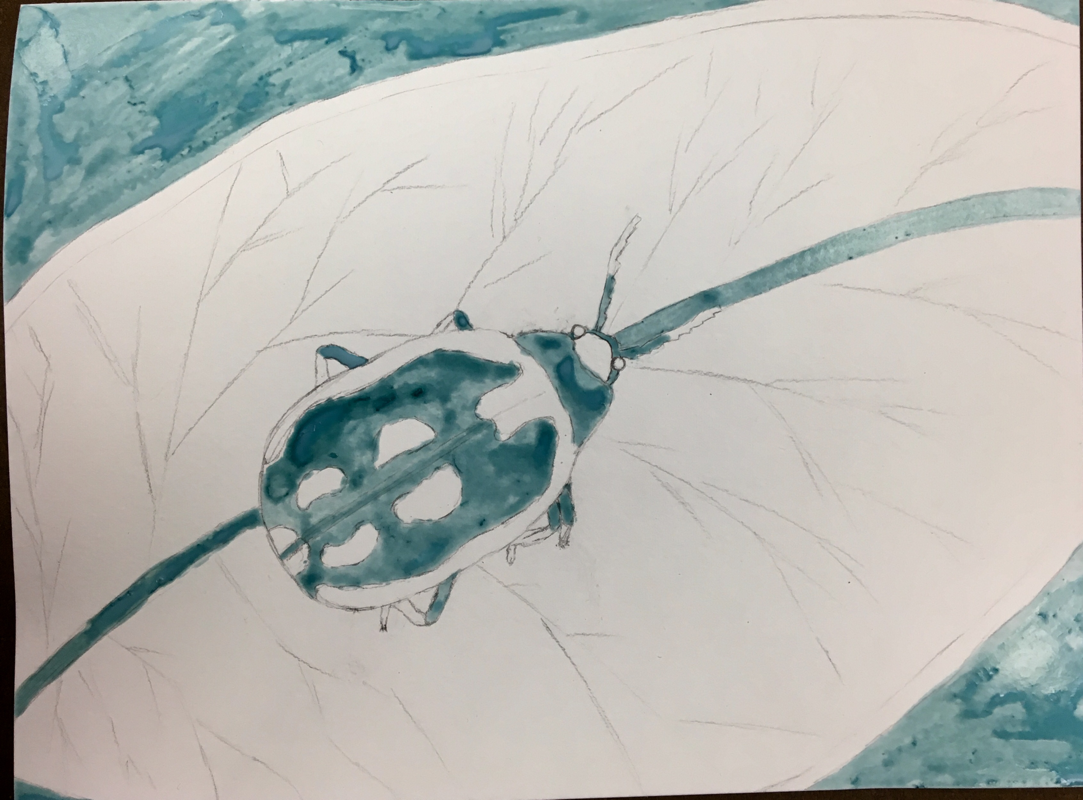
Watercolor Methods
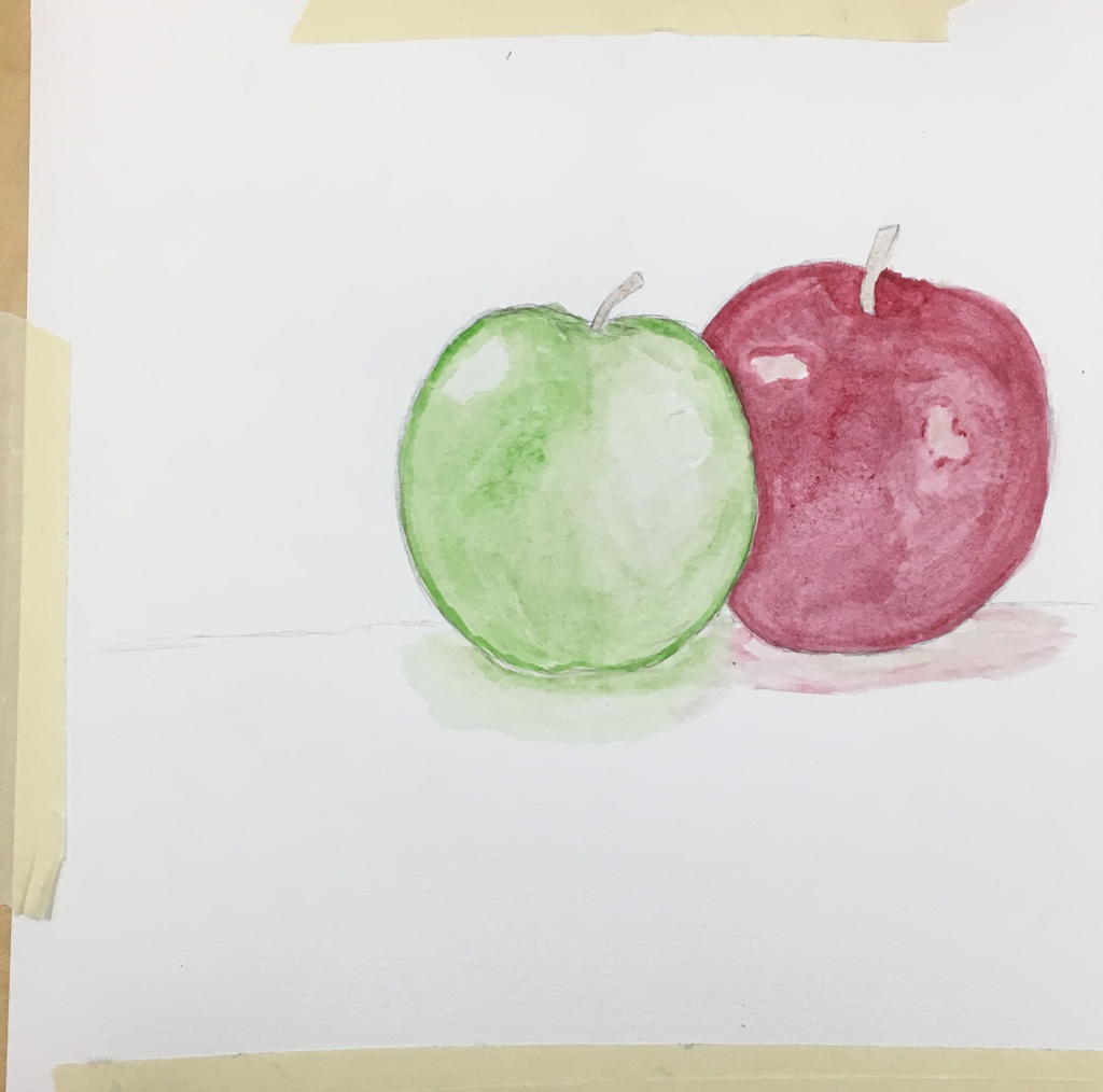
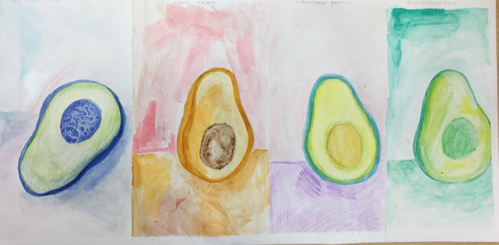
Watercolor fruit
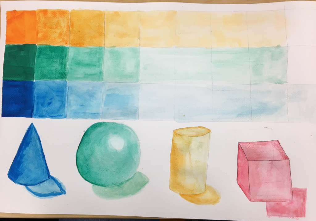
Watercolor value chart/ shapes
Watercolor Fruit
Masking fluid watercolor
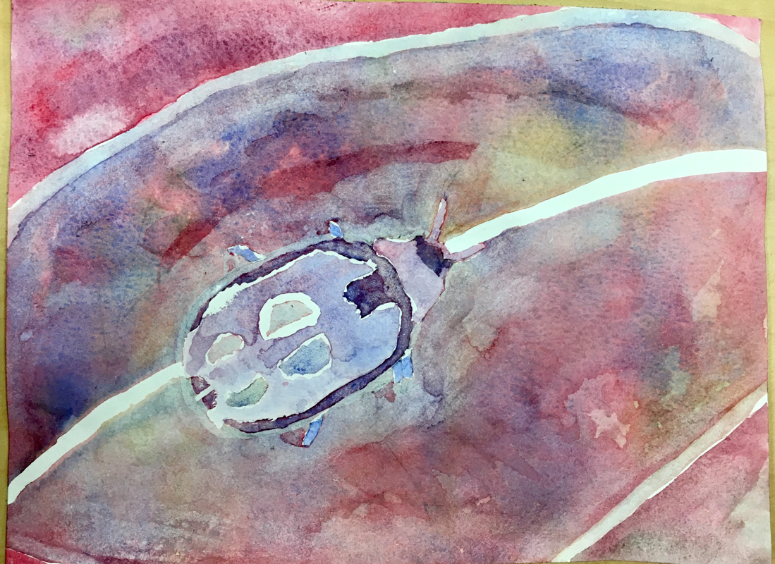
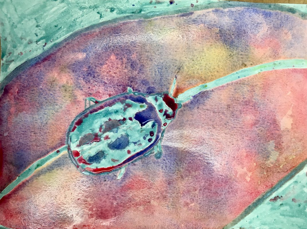
For our watercolor assignment we were taught how to use masking fluid in our watercolor pieces. We masked off the values and then we squirted different colored paints on top (in many layers.) I struggled with trying not to make brown by pouring all of the colors on my paper. Four things I learned from this assignment were controlling the water, letting the paint do the work, how to successfully peel off dried masking fluid, and a new method of watercolor. If I were to do this project again, I’d let the water do more of the work because in some parts I had to use my hands to make sure the paint was distributed evenly across the paper. I had to do 3 layers of paint and masking fluid to get the vibrant colors that I ended up with. For my colors, I decided to stay away from too much yellow and stuck with blues and reds. The mini watercolor lessons were beneficial to me since watercolor is not my strongest suit. It allowed me to practice more. Having a guest artist come into class was a positive experience as it let us receive advice and tips on how to successfully produce our piece. I learned from the artist that if you want to make a living as an artist, you have to be very very skilled.
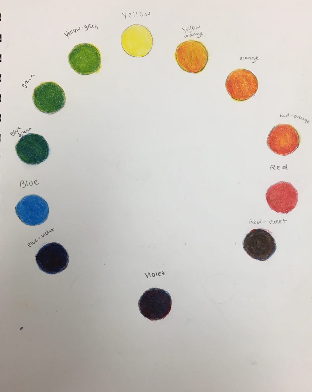
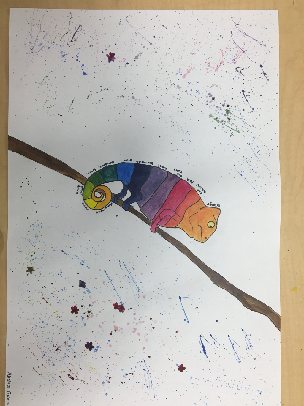
Color wheel
Prismacolor Shapes
Three color self portrait
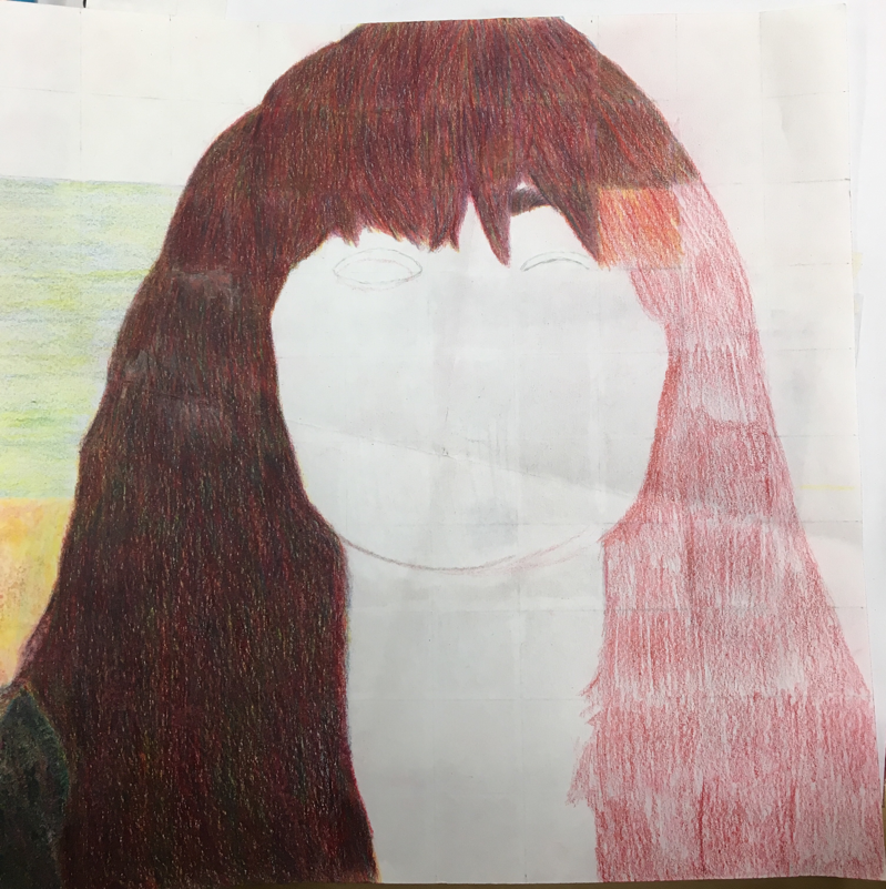
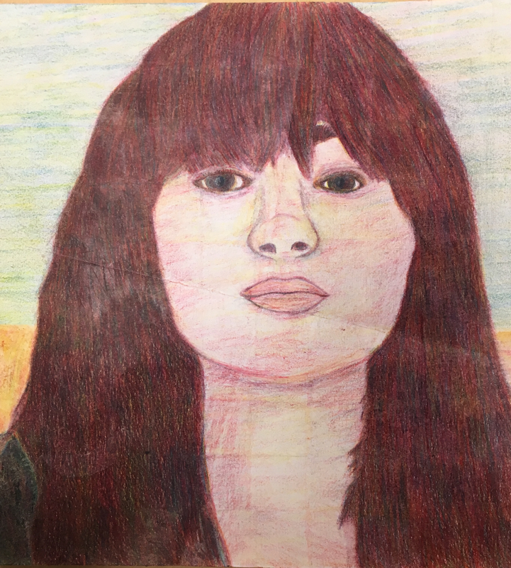
I struggled a lot during this project, which resulted in starting over 2 times because I couldn’t grasp the concept of square by square. My final piece could’ve definitely been neater and it’s obvious that in some areas that I didn’t use the square by square method. Using the blending tool was quite challenging at first because I’d press too hard which caused the color to become to dark. Mixing colors was also a challenge, I struggled with getting dark brown/black which resulted in a reddish brown color. I created value changes by darkening the color in some areas of my face to create the illusion of a shadow. I was not able to get all the colors I wanted from the 3 colors due to my impatience when it came to blending and layering. I really like how Taylor’s final piece turned out. She (for the most part) used the square by square method and so her final turned out really nice.
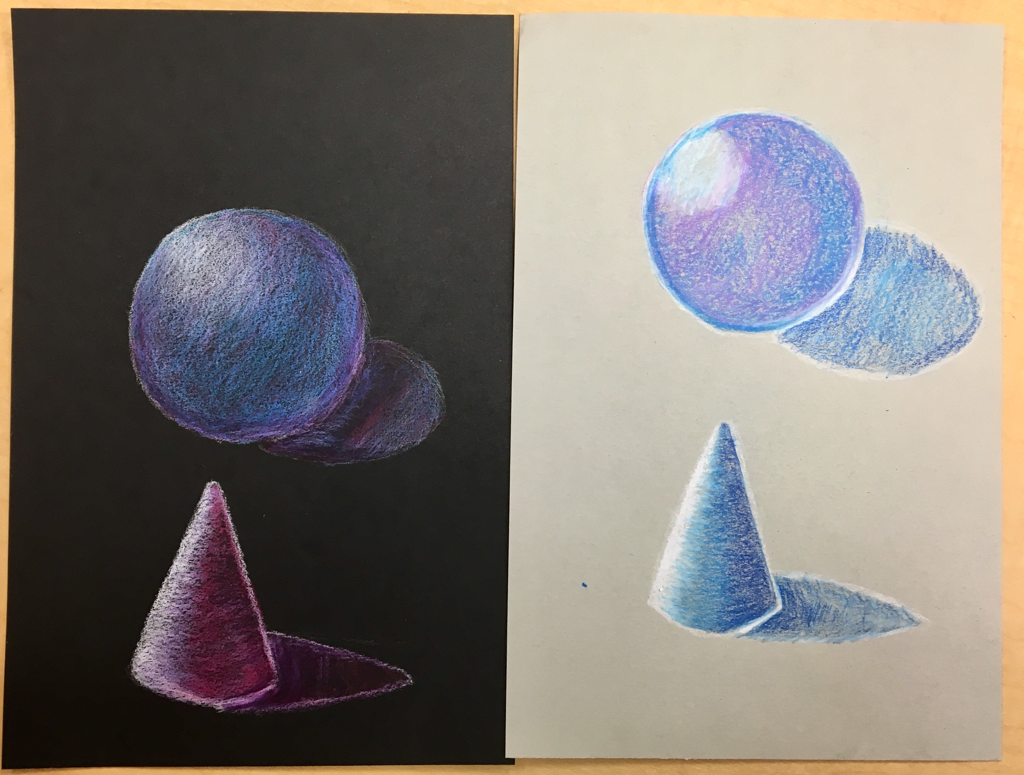
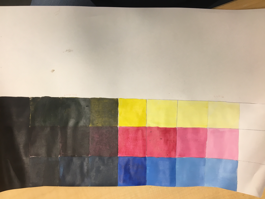
Acrylic Value Chart and Color Wheel
Piece of painting
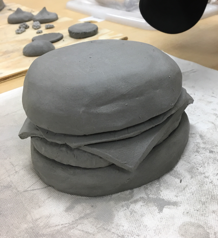
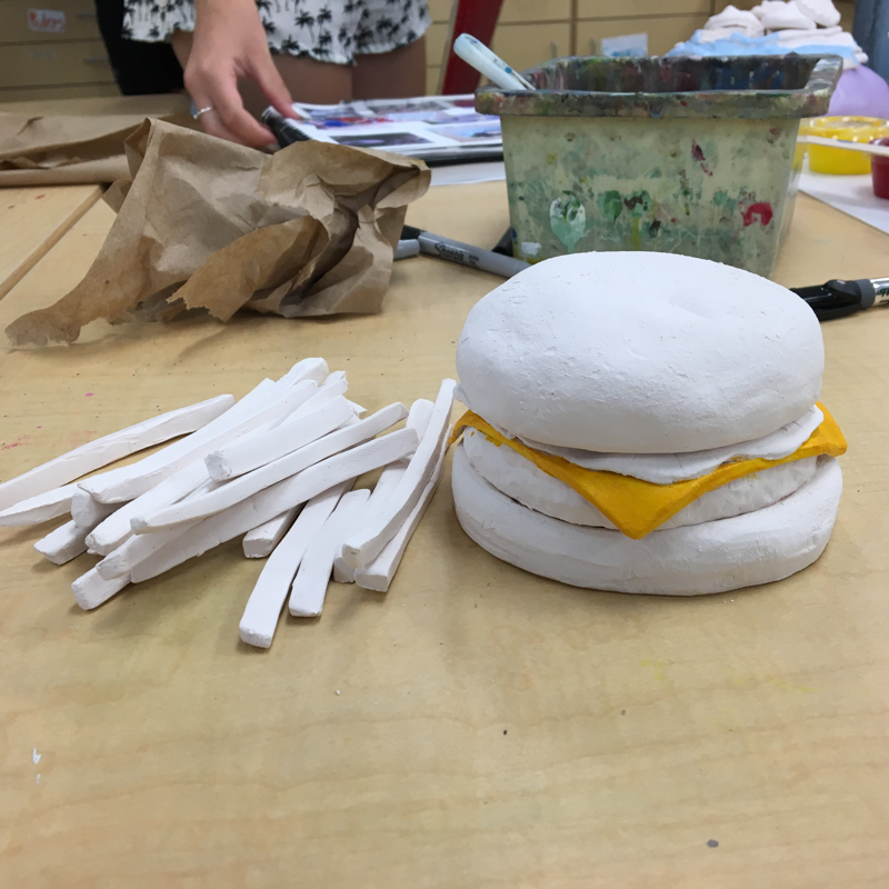
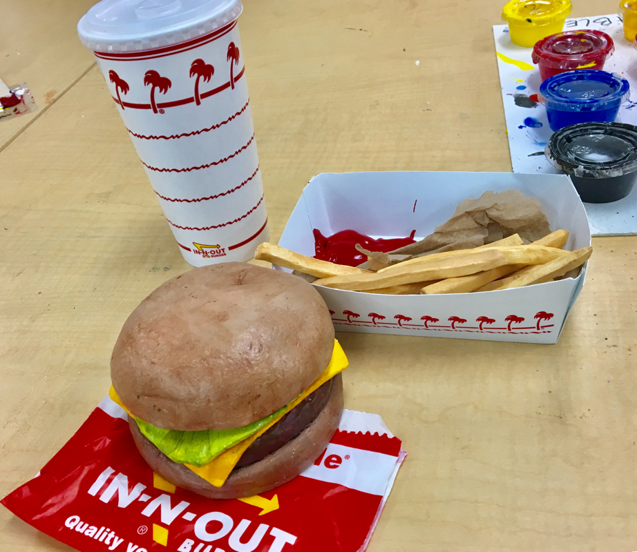
Clay food
1. Describe the craftsmanship of your sculpture. (Is it neat and well executed?)
My clay sculpture is (for the most part) neat, although I could definitely have improved on the painting portion of my project, I feel I succeeded in creating a realistic food sculpture. I used the different tools to manipulate and mold the clay into my desired shape (ie. the hamburger patty.)
2. What was the most difficult part of this project?
The most difficult part of this project would have to be the painting part of the assignment. I struggled to create the right color for the bun and ended up with a slightly darker tone of tan that I wanted. I also found it quite difficult to paint in the nooks and crannies of the clay after it was baked in the kiln.
3. Did your color choices work together harmoniously?
I feel that my color choices did work well with each other. I managed to mix colors that were accurate to the picture of the burger I was using for reference. Although, the color of the bun does stand out a bit more than it should as it is darker than a normal, real burger bun.
4. Is your sculpture interesting from all views?
Yes. I tried my best to mold the clay in a way that would catch the eye in all areas by adding texture and trying to make it look identical to an actual burger.
5. Describe the differences in constructing a sculpture and doing something 2D.
Constructing a sculpture requires a lot more physical labor as you have to wedge and mold the clay to your liking while 2D art is more simplistic and requires less physical activity, 2D art is also a lot easier than sculpture.
6. How did you create textures in your sculpture?
To create textures on my burger bun I used a slightly damp sponge and blotted the still soft clay with it to give a bread-like feel to the clay. For the fries I used a scraping tool to get the edges of the fries nice and sharp like how it would look if it were real.
7. Does your sculpture look like the actual food? How did you accomplish this?
I believe my sculpture does look like an actual burger and fries. I accomplished this by mixing a lot of colors until I got the right ones and made sure to create textures so that the pieces would look good enough to eat.
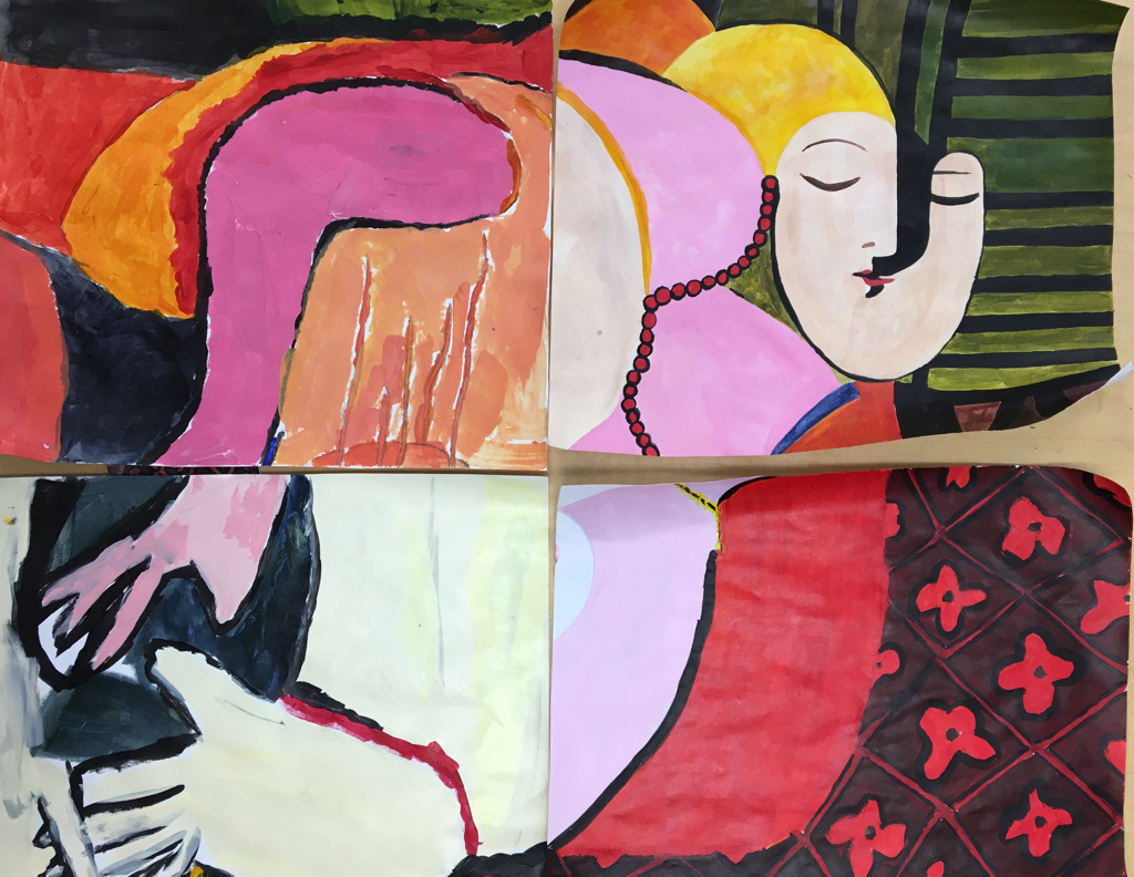
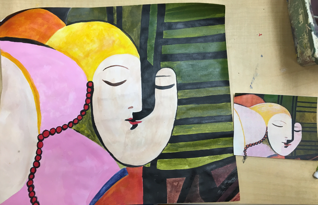
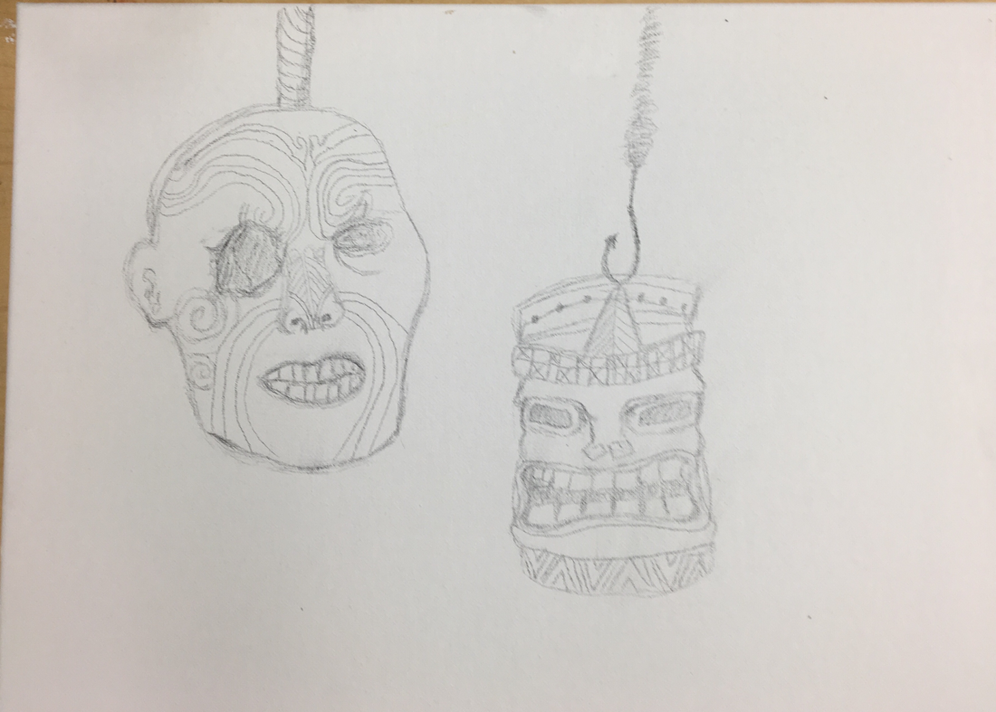
Painting in artist’s style
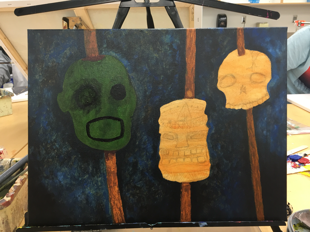
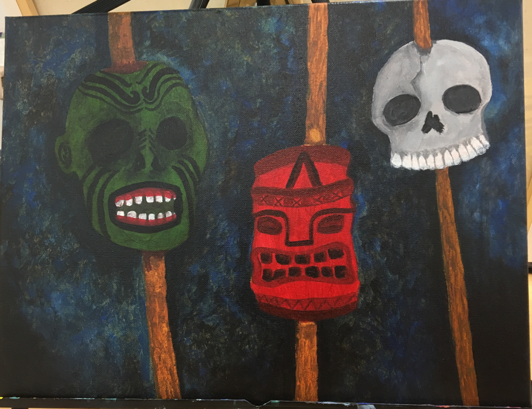
1. Who was your referenced artist for the painting? Name 4 main ideas you used from your research to create your painting.
Name- Emil Nolde
1. He was one of the first Expressionists of his time.
2. He was a German-Danish painter and print maker.
3. He painted a lot of beautiful, slightly disturbing pieces during his time.
4. He often sought to capture the emotions that his subjects were displaying in his pieces (hence the expressionist.)
2. Describe the craftsmanship of your painting. (Is it neat and well executed?)
I felt that I did a good job on this piece as I spent a lot of time planning and deciding what to do to improve it. I tried my best to make it as neat as I could by using smaller brushes to get fine details and such.
3. What was the most difficult part of this project?
The most difficult part of this project was the planning. I spent a day and a half just decided what I wanted to paint, being indecisive about the composition of my piece, sketching it out, and erasing what I didn't like about it. It was a time consuming process and I feel that if I had decided earlier, I might've ended up with a better final piece.
4. Describe your color choices and how they reflect the work of your chosen artist?
Emil Nolde was notorious for his use of bright colors so I tried to incorporate that into my own piece. I used Nolde's still life of masks to help influence my use of colors. To stick with his theme, I used colors such as green and red to help the subjects in my piece stand out.
5. Describe how the style of your landscape reflects your chosen artist.
My piece was more of a still life than a landscape but I feel like my slightly disturbing subject choices and colors related to Nolde's eclectic, yet strange style.
6. What do you think your chosen artist would say if he or she could see your painting today?
I honestly don't know what Emil Nolde would think about my painting if he were still alive. He would've probably wanted more color and expressions in my piece seeing as most of his art was colorful and displayed a range of emotions.
7. What would you do differently if you were to do this project again?
I wouldn't have spent days deciding on my ideas and would have focused more on color choice and what I could add to my painting to make it relate to Nolde's style more.
